In my career, I have run multiple projects and programs which required reporting status on the progress and ultimate health of the program. After trying and testing a few approaches, I have come up with a simple scorecard design, which suits the needs of pretty much most of the programs / projects I have run. Especially in the agile world we live in, I love the power of these simple and flexible scorecards which have zero to minimum learning curve.
Today I am going to share that approach with you, do share in the comments below if this approach works for you as well or not.
So let’s start designing the scorecard with 3 basic elements:
- Who is the audience? The first question to ask when designing the scorecard is, who are you designing it for? An exec of the program would be interested in very different set and level of information than the person executing on the task on the ground. The key here is prioritize ruthlessly. Don’t be tempted to solve the problem for everyone. That’s a recipe for disaster.
- What do they care about? Once you identify who are you designing the scorecard for, the next step is understanding what do they care about? Talk to them, setup 1:1s with them and their close associates. Get as many details as you can. This will help you design the metrics which will feed into the scorecard calculations.
- What is the action you want them to take? At the end, once you have all the metrics defined, the final and the most important step is what action you are trying to encourage with the results of the scorecard. This will help you define the legend (or output types for your scorecard).

Once I decide on the above-mentioned 3 steps, I use colors to represent outcomes of the metrics and scorecard. For example, if I need to represent 4 outcomes, then I would use:
- Red: Worst outcome, represent some work needs to be done and an action is required asap
- Yellow: Not good enough, represent some work needs to be done but the severity of it is not as bad as Red
- Green: The best outcome, represents the work required is already completed to the satisfaction
- White: Not applicable, to consider for scenarios where the metric / scorecard is not applicable to a particular element.
Most of the times, these 4 colors are sufficient for me to design the scorecard. If I need more diversity in outcomes, I add more colors. But If you are getting to the point of adding more colors, then think hard if you really need more colors or can you do with the existing colors. More colors you add to the scorecard will add complexity, and increase the learning curve for your readers. Try to keep it simple!
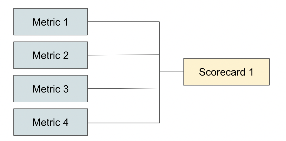
Once these colors are assigned for each of the metrics, you will need the logic to generate outcome colors for the scorecard, based on sub-metrics. Here was what generically works for me and would love to know what tweaks you had to make in your design to make it work for your scenario:
- Gray: If all the sub-metrics are Gray
- Green: If all the sub-metrics are Green or a mix of Gray and Green
- Yellow: If one or all of the sub-metrics are Yellow, in combination with Green and Gray
- Red: If any one or more of the sub-metric is Red
I am generally not a fan of weighted scorecards. Nothing wrong with them, but the challenge has been the ability to ramp up the readers on how the scorecard is generated. Instead of having productive conversations on what metrics are important and how a particular item is scoring on the scorecard, the conversation often focuses on how these scorecards are generated. Additionally, any change in the metrics used for calculation of the outcome, results in the re-explaining to everyone how the new calculations work and how does it impact the previous scores generated.
Maybe there is a better way for handling weighted scorecards in an agile environment, but I haven’t found one.
This is a super simple approach which has worked for most of my scorecards. Let me know in the comments below if this approach worked for you as well or not.
